The safety reporting product, module by module
Ten modules of a safety reporting interface concept, designed in September 2026 from the December 2025 research, each screen annotated with the research finding that drove the decision and the alternative it replaced.
- Delivered
- Into the live reporting programme in December 2025: the findings report, a five-stage service blueprint, a prioritised three-phase roadmap and the form prototypes, refined through a stakeholder validation session.
- Shown here
- An interface concept designed in September 2026 from the December 2025 findings. The delivered work was the report, the blueprint, the roadmap and the form prototypes; this is the product the findings argue for, built on a configured vendor platform the business had already bought.
- Evidence behind it
- The study ran more than 50 interviews and a 55-response survey, visited eight restaurants and walked through the forms twice with the safety team. Existing data sat beside it: the safety items on the network-wide employee engagement survey, about 30,000 responses a year. The recorded interviews, the 55-response survey and the visit notes became 232 typed insight records tied to a five-stage blueprint.
- How it is built
- Designed in code on a token-based design system, gated by a contrast script and a site lint. Components were checked against shipped products before they were drawn; the reference list is in the repository.
- Confidentiality
- Vendor, sites and people are removed, and every name and number on these screens is written for the walkthrough.
The product in brief
The problem. A safety incident and hazard reporting platform, configured for one workflow across 900 restaurants: a team member notices something, scans the poster, fills in the form. The research found a different workflow in almost every restaurant. The team member tells the manager. The manager decides whether it is worth logging, logs it if so, and sometimes closes it without telling anyone. Reporting volume varied widely between sites and the platform's own data could not say whether a quiet restaurant was safe or silent.
What the research changed. The business assumed location explained the difference, so the sample was designed to test that: eight restaurants across high- and low-reporting sites, higher- and lower-crime suburbs, metropolitan and regional. In the sampled restaurants, the manager's routine explained the difference more consistently than location did. That finding reorganised the recommendations, and it organises these screens.
From the findings to the product. The delivered recommendations changed what the form asks and what managers do, inside a platform the business had already bought. This is the next move: the whole service redrawn as a product, module by module, following the navigation the restaurants already knew. Each module below is one item from that navigation, designed from the evidence.
How each module is set out. The finding sits above the screen. The screen is shown whole, at full size, with numbered pins. Each pin names the finding, the decision it drove and the alternative it replaced. The states that matter sit underneath. The case study carries the research, the method and what the internal tool saved.
Quick Add: reporting from the floor
The form asked questions the reporter could not answer. Incident type came first, with options like first aid or lost time that nobody can predict while their hand is under the cold tap; the notifiable-to-the-regulator question sent people to a compliance matrix. Even area safety leads admitted asking the restaurant's safety champion which option to choose. Misclassified reports were sent back from above, and everyone learned that reporting was a way to get something wrong.
The redesign inverts the order. The reporter says what happened and how it happened, in the words they would use to a manager. Severity, classification and the regulator question move to the manager's review, after the welfare check, when the outcome is actually known. The safety team supported the inversion because it also gives them cleaner data.
Everything on the reporter's side is built for one thumb, mid-shift, on a personal phone, in a restaurant whose phone policy may not allow it. Nothing is asked that the system already knows.
- 01 / 07The barrier
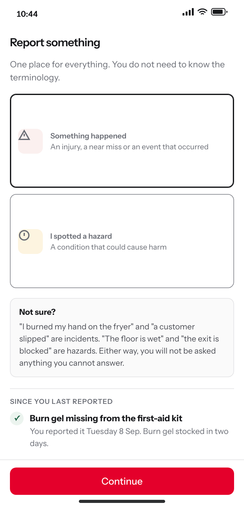
The hesitation is at the very start
Team members stopped at the incident-versus-hazard choice, especially for a near miss. One entry point removes the first place people gave up, and the examples resolve the only hesitation the research found.
People reported to a person, not a platform. The barrier was the form, the phone and the threshold.
ReplacedTwo forms with a chooser in front, which asks the reporter to classify before they have described anything.
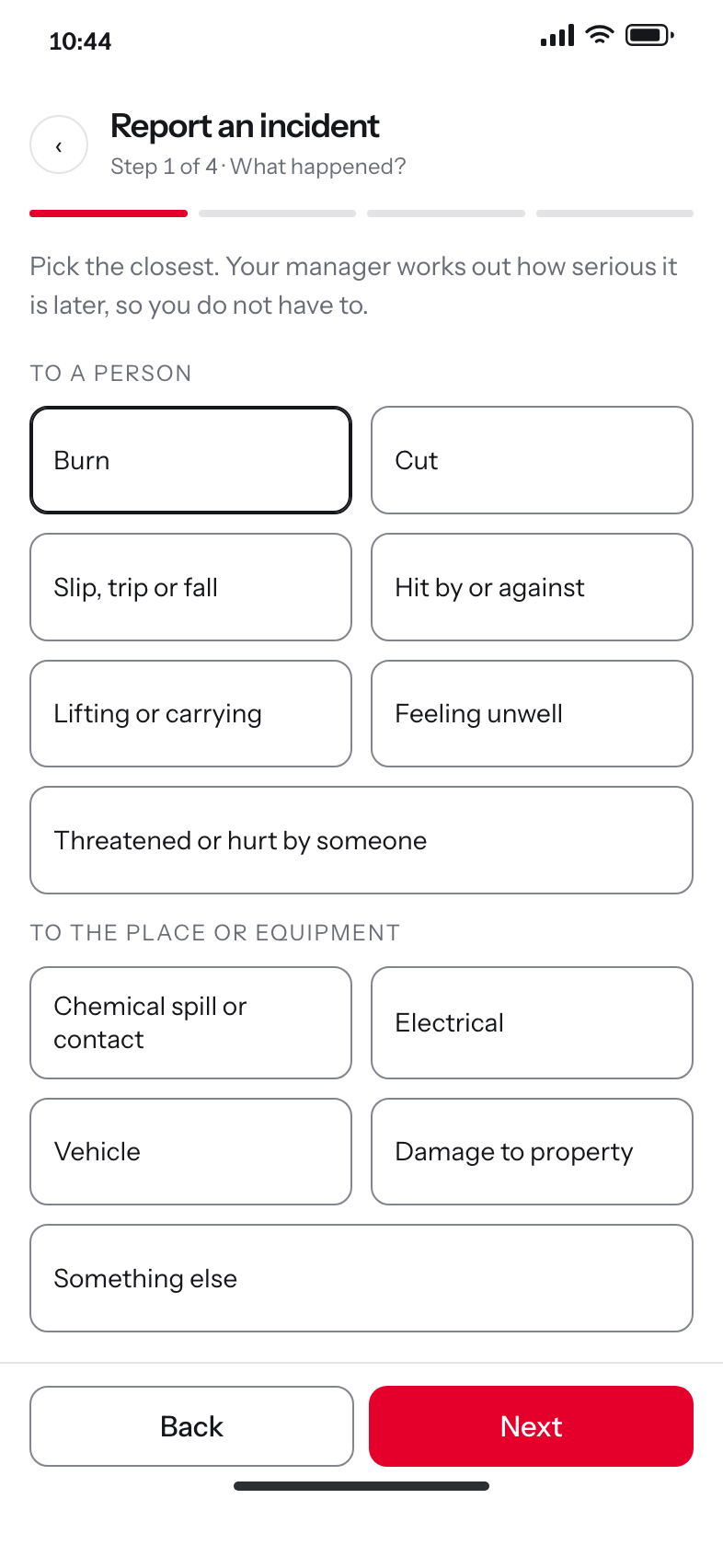
- 02 / 07Decision
Mechanism first, outcome later
What happened is the one thing the reporter knows for certain in the moment. Burn, cut, slip, written in the words people used in interviews rather than in the platform's taxonomy.
Nobody can predict whether it is first aid or lost time while their hand is under the cold tap.
ReplacedA fifteen-option incident-type dropdown, which is the field that came back corrected from above.
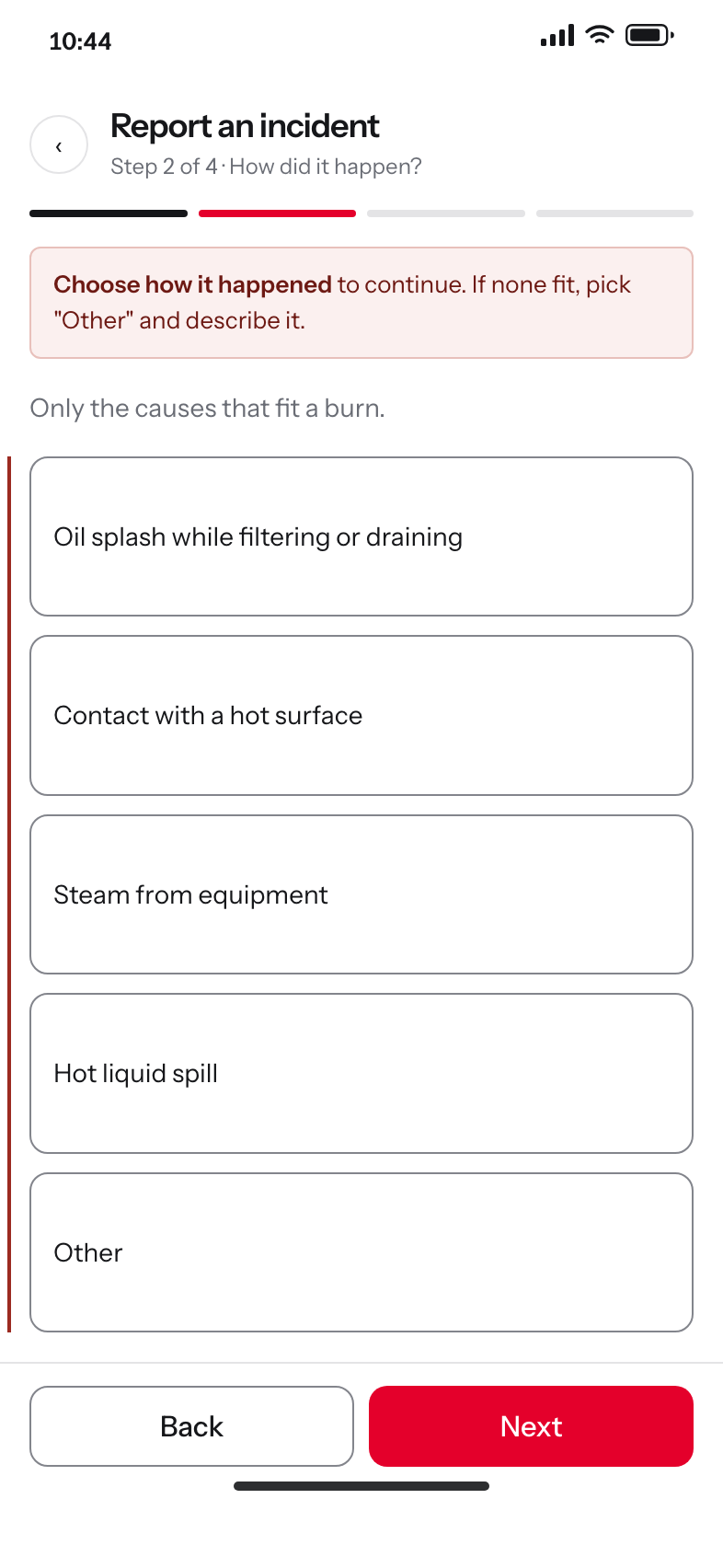
- 03 / 07Decision
Only the causes that fit
Step two shows the causes that belong to the mechanism chosen at step one, so a burn never offers a vehicle cause. The error marks the question, not every answer.
ReplacedOne long cause list for every mechanism, faster to build and slower to use.
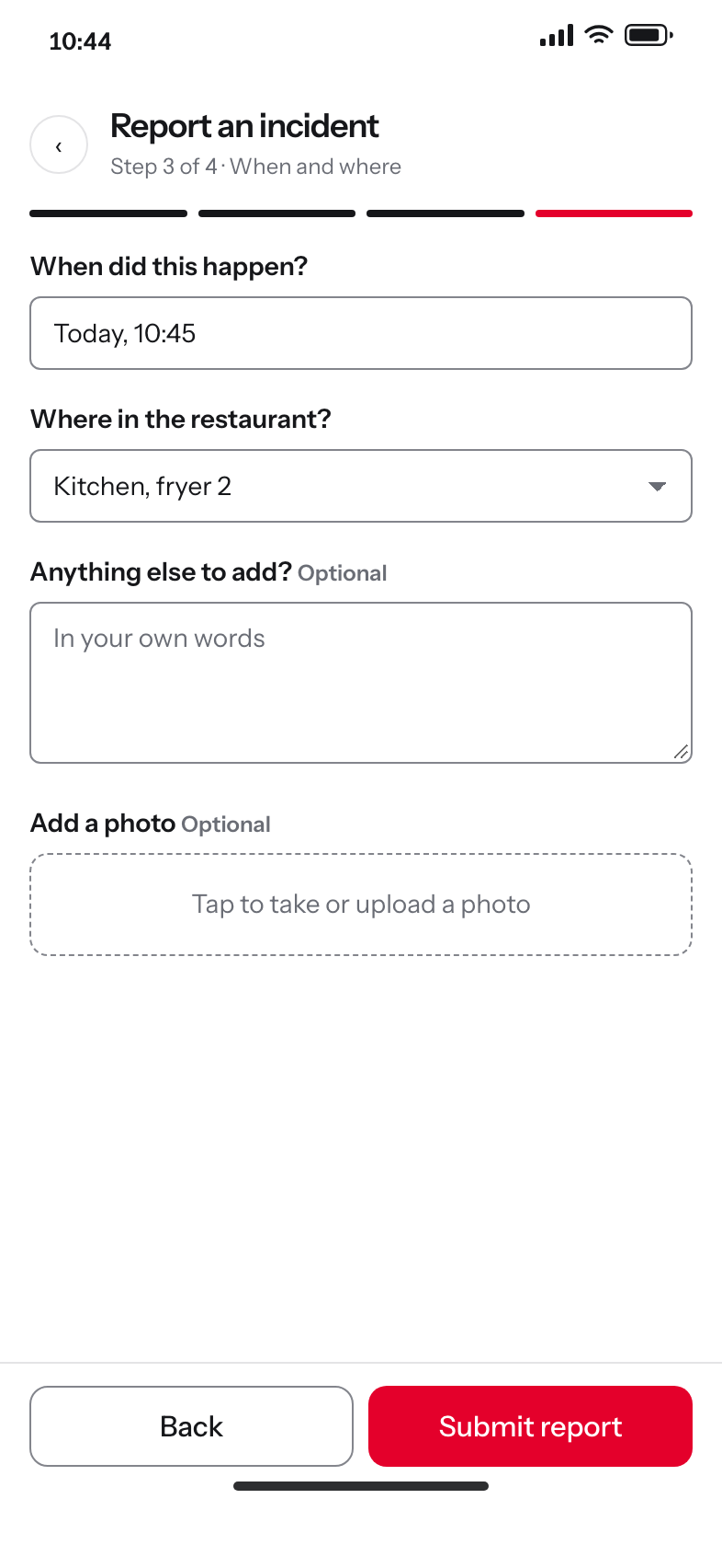
- 04 / 07Shift reality
When and where, already filled in
Both default to now and to the area the reporter is in, because reports are made standing up, mid-shift, on a personal phone. These are the only two required fields in the flow.
The cost people described was stepping off the floor during a rush.
ReplacedA free-text location field, which produced data nobody could group.
- 05 / 07The promise
The thing the old service never did
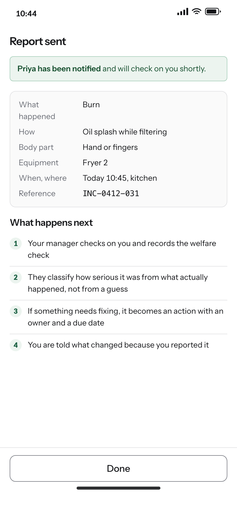
The confirmation names what was sent and what happens next, and ends on the one thing reporters said they never got.
Minor reports were closed without a word, which built the belief that reporting does nothing for anyone else.
ReplacedA reference number and nothing else.
- 06 / 07Decision
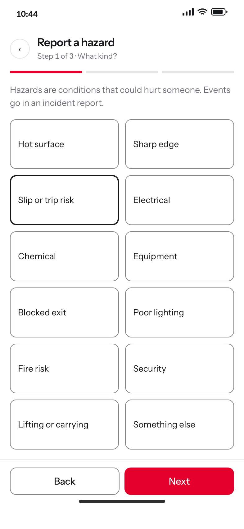
A hazard is a condition, not an event
The hazard path describes something that could cause harm and never asks about an injury. The old list mixed events in, so nobody knew which form to use.
“The floor is wet” is a hazard. “Someone slipped” is an incident.
ReplacedOne combined form with conditional fields, which still opens on the question the reporter cannot answer.
- 07 / 07The handoff
It leaves the phone and lands on a person
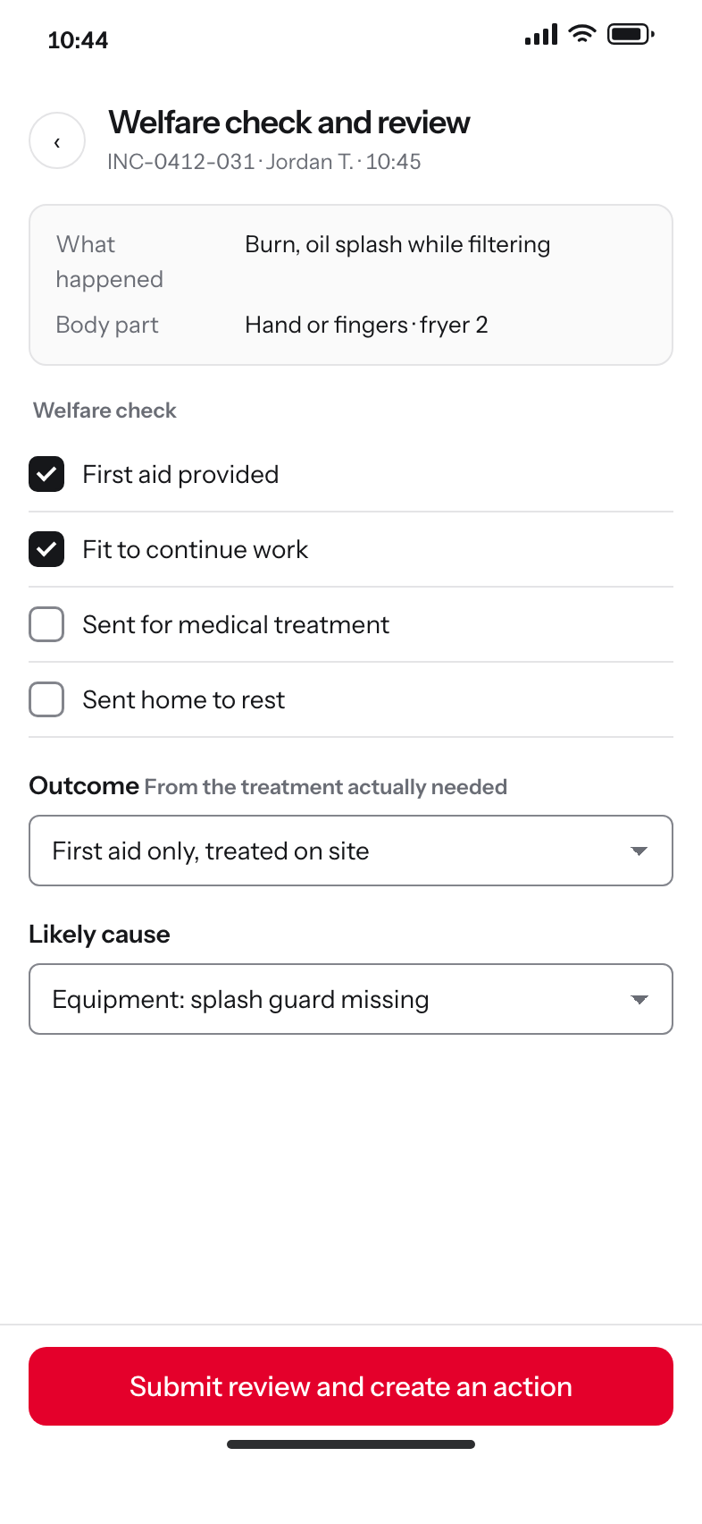
The report opens on the manager's screen with the welfare check as the current step. Severity is set here, from the treatment actually required, and the regulator question appears only when the outcome makes it relevant.
Managers have the context for cause; team members have the context for mechanism. Each side is asked what it knows.
ReplacedLeaving severity with the reporter and correcting it later, which is what taught people that reporting was a way to get something wrong.
Figure 1The entry screen. One question, two answers, and the examples that resolve the only hesitation the research found. The old form opened on a dropdown of incident types.
Dashboard: the restaurant manager's shift
In the sampled restaurants, the manager's routine explained reporting better than location did. Where a manager talked about safety, thanked people for reports and showed the system on the first shift, reporting was strong regardless of where the restaurant was. That finding made the manager's screen the most important screen in the product.
So this dashboard is not a reporting console. It is a shift tool: what needs a person today, what is overdue, what was fixed and who reported it, and the routine that the research found to be the strongest lever. The vendor product opened on a permissions wall where the dashboard should have been.
The two charts answer the question the safety team could not answer from the platform's data: whether a quiet restaurant is a safe one. Hazards and incidents are plotted separately, because a restaurant finding hazards before they hurt anyone looks nothing like one that reports only after an injury.
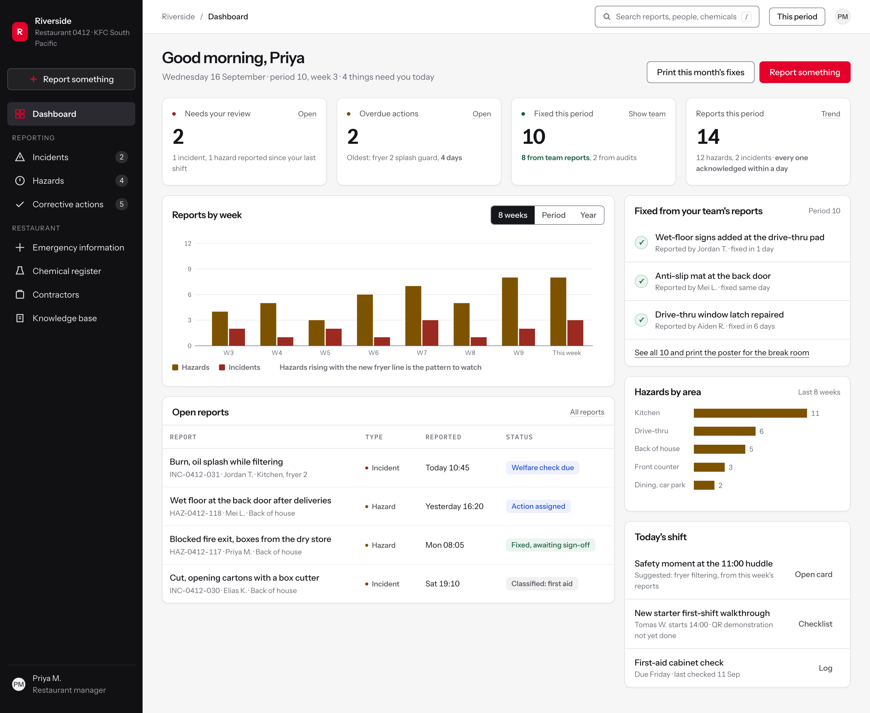
Figure 2The restaurant manager's dashboard at 1440 by 900. Four counts, a weekly trend read in a sentence, the open reports with the next human act as their status, and the loop closed on the right.
One way in, and it is a verb
FindingThe platform assumed a team member would scan a poster and fill in the form. In practice they told the manager, who logged it or did not, so the manager is the heaviest user of the system.
DecisionThe manager's primary action is the same action the team member gets on a phone: Report something. It sits above the navigation, not inside a module, so logging on someone's behalf is one click from anywhere.
RejectedA New incident button inside the Incidents module, which makes the reporter choose the record type before they have described anything.
Sorted by what needs a person, not by record type
FindingReports sat waiting because nothing told the manager which ones needed them today; the platform's lists were organised by the record's type rather than by whether anyone was waiting.
DecisionThe first tile is Needs your review, counted across incidents and hazards together, with the reason written underneath in words a manager reads once.
RejectedA tile per module (incidents, hazards, actions) which reports the shape of the database rather than the shape of the shift.
Fixes are counted, and so is where they came from
FindingMinor reports were closed without a word, and over time people came to believe that reporting helps with a claim but changes nothing. The restaurant where a fault was fixed the same day had a story people kept telling.
DecisionFixed this period is a headline number, split to show how many came from the team's own reports. It is the number the manager repeats at the huddle.
RejectedCounting reports received, which rewards volume. The safety team's view was that an incentive on hazard reports gets you reports, not fewer hazards.
Two series, because the ratio is the signal
FindingReporting volume varied widely between restaurants, and low volume could mean a safe restaurant or a silent one. The platform's data could not tell the difference.
DecisionHazards and incidents are plotted side by side every week. A restaurant finding hazards before they hurt anyone looks different from one that reports only after an injury, and the reading is written under the chart in a sentence.
RejectedA single total-reports line, which is the number that could not distinguish a safe restaurant from a silent one.
The status is the next human act
FindingIncident type and severity came first on the form, with options like first aid or lost time that nobody can pick while their hand is under the cold tap, and classification errors were sent back from above.
DecisionA report's status names what a person does next: welfare check due, action assigned, fixed and awaiting sign-off. Classification is an outcome the manager records later, so it never blocks the report.
RejectedStatus as a workflow code (open, triaged, pending classification), which describes the database's state rather than anyone's obligation.
Dashboard: the area manager, twelve restaurants
Reporting volume varied widely between restaurants and nobody could say why. Low volume could mean a safe restaurant or a silent one, and the existing lever was a reminder email that went to everyone and told no one anything.
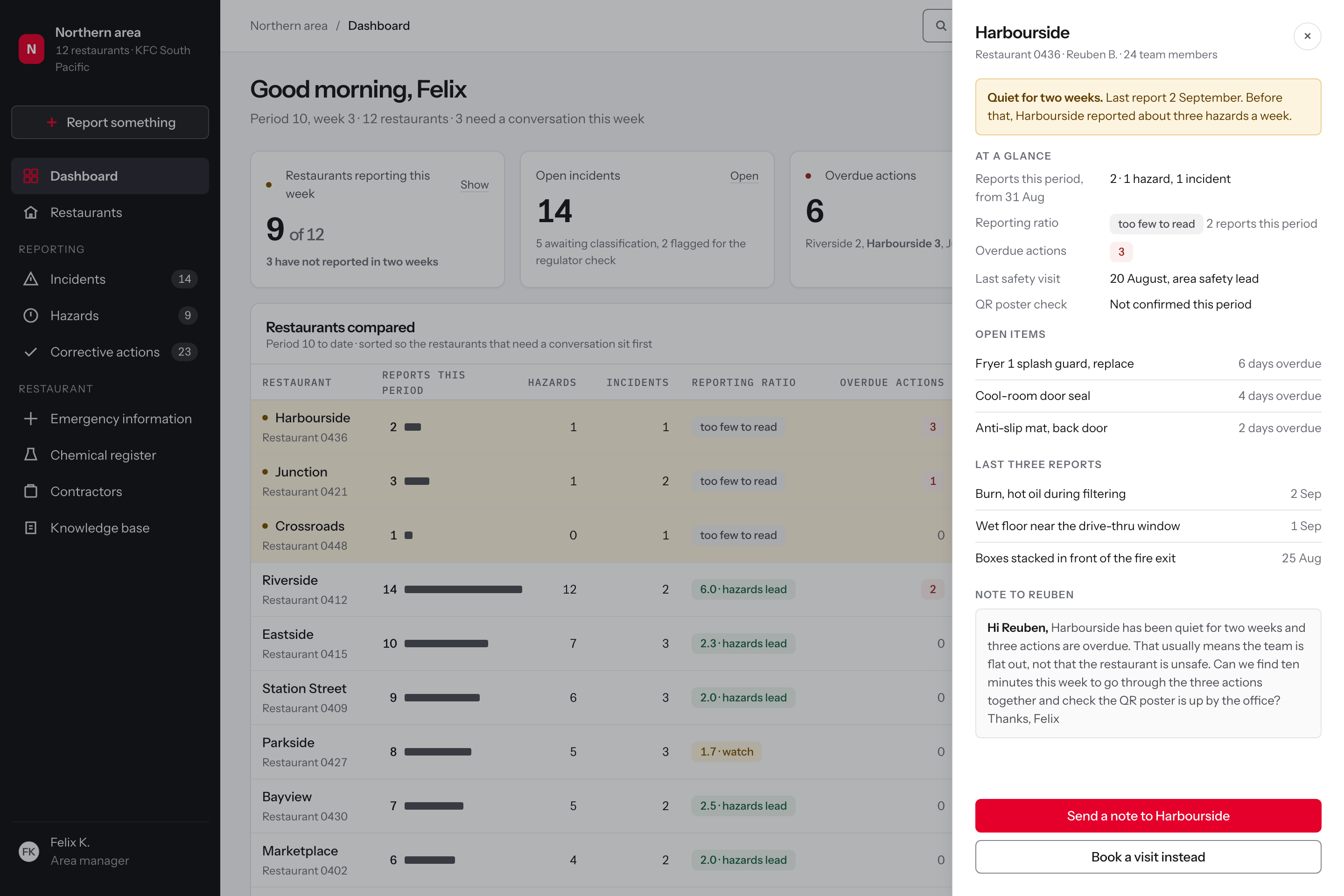
The area view compares restaurants on the ratio of hazards to incidents rather than on report counts, and it names the three conversations worth having this week instead of sending twelve people the same message. The ratio is a proposed signal: a prompt for a conversation until the safety team has checked it against outcomes, and a restaurant with too few reports to read says so instead of carrying a tint.
This is the screen where the study's central finding becomes an operating instrument: if the manager is the variable, the area manager's job is to find the managers who need a conversation, and to have it on evidence.
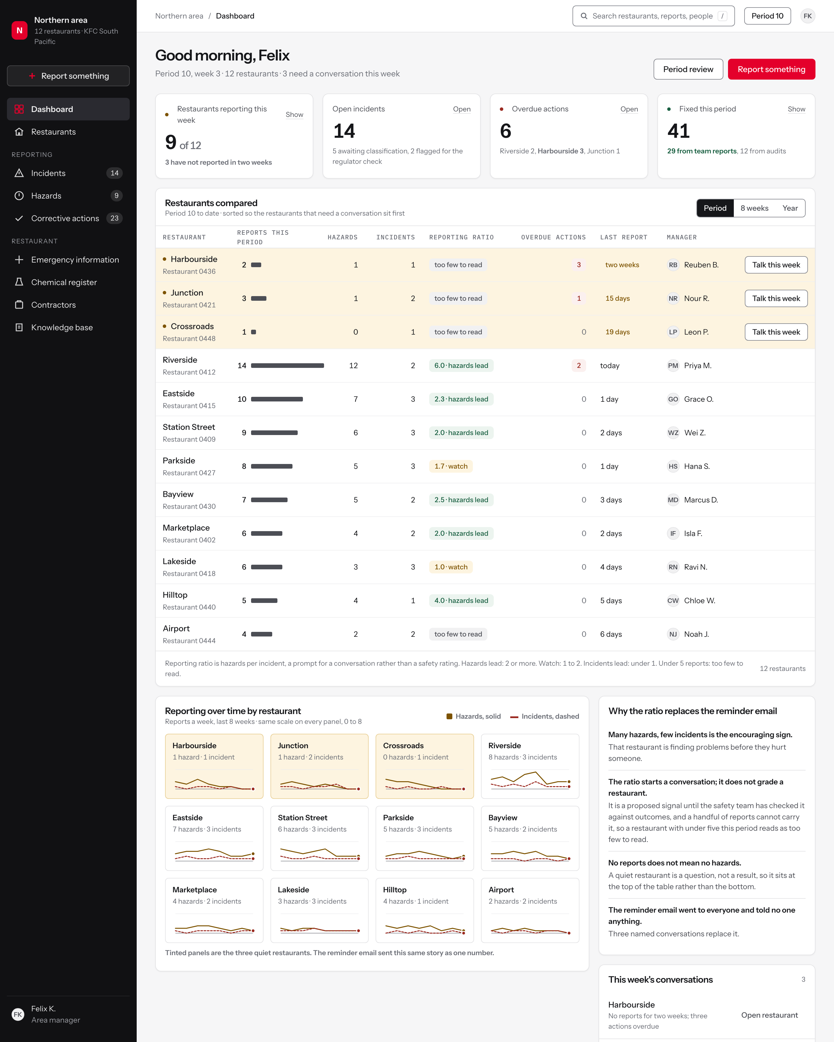
Figure 3The area manager's dashboard. Twelve restaurants compared, three flagged, and the reasoning written next to the table rather than left implicit.
Restaurants reporting, not reports filed
FindingAn area safety lead received an automated reminder email listing how many incident and hazard reports each restaurant had made, period to date and year to date, and used it to follow up.
DecisionThe first tile counts restaurants that reported, not reports received, and names how many have been silent for a fortnight. The number an area manager acts on is how many teams have gone quiet.
RejectedA total report count for the area, which rises when one busy restaurant reports a lot and hides eleven others.
Overdue actions named by restaurant
FindingReviewing weekly, an area safety lead found many incidents in their area sitting overdue, and a backlog creates pressure to close reports quickly without the proper steps.
DecisionThe overdue tile breaks the number down by restaurant on the tile itself, so the follow-up is a named conversation rather than a queue to clear.
RejectedA single overdue count linking to a mixed list, which invites bulk closing rather than a conversation with the three managers who own the work.
The quiet restaurants sort to the top
FindingZero reports in a period was already treated as a signal to check in, not as good news.
DecisionThe table opens sorted so the three restaurants that have gone quiet sit first, tinted, with a dot on the name. The rule the area safety lead already applied is built into the default view.
RejectedSorting by report volume, which puts the restaurants that need attention at the bottom of a twelve-row table.
Hazards per incident as a proposed leading indicator
FindingSome restaurant groups run competitions and recognition for reporters and report more. The research cautioned that rewarding counts encourages low-value reports, and suggested recognising outcomes instead.
DecisionThe ratio of hazards to incidents is the headline measure, tinted as hazards lead, watch or incidents lead. Many hazards and few incidents reads as a team finding problems before they hurt someone, which volume alone cannot show. It is a prompt for a conversation rather than a rating until the safety team has checked it against outcomes, and under five reports in a period it shows as too few to read.
RejectedA leaderboard of top reporters, which rewards volume over value and was flagged in the research as a risk.
Days since the last report, not a tick
FindingBecause reports arrive verbally, the manager decides what is worth logging, checks the story and enters it. Reporting is strong where the manager has built the routine and weak where they have not.
DecisionTime since the last report is shown as a badge that ages, so a manager routine that has lapsed shows up within a fortnight rather than at the period review.
RejectedA compliant or non-compliant flag, which cannot distinguish a restaurant that reported yesterday from one that reported six days ago.
The state that matters
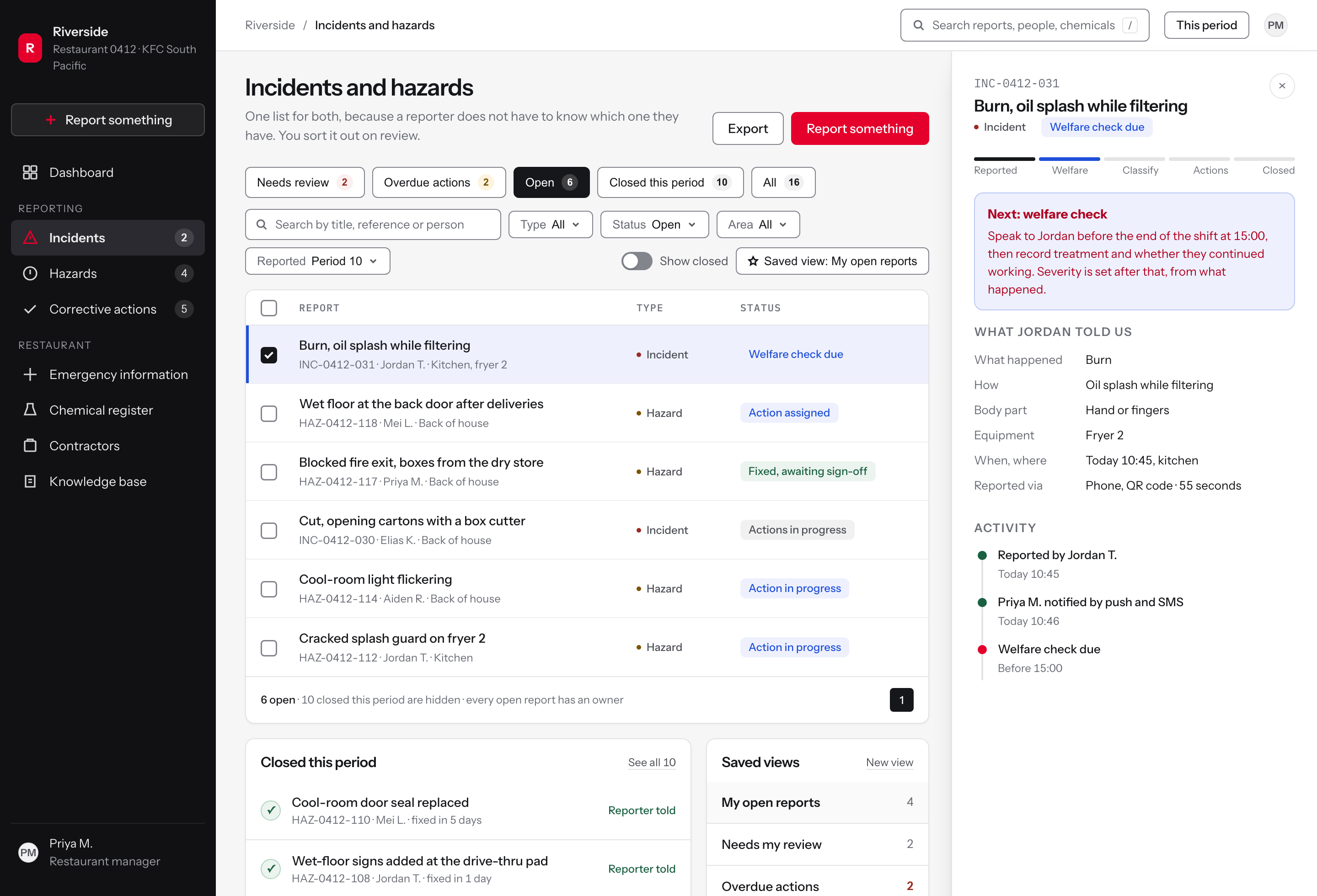
Incidents and hazards: one register, two types
The platform's hazard categories contained events rather than conditions, so the two record types blurred at the point of entry and then had to be kept apart everywhere else. Reports also sat waiting because nothing said which ones needed a person today.
Incidents and hazards live in one register with one filter, because a manager's question is about their restaurant this week, not about a record type. The type is a column, not a navigation decision.
Status is written as the next human act. Welfare check due, action assigned, fixed and awaiting sign-off: each one names something a person does, so a list of statuses reads as a list of obligations.
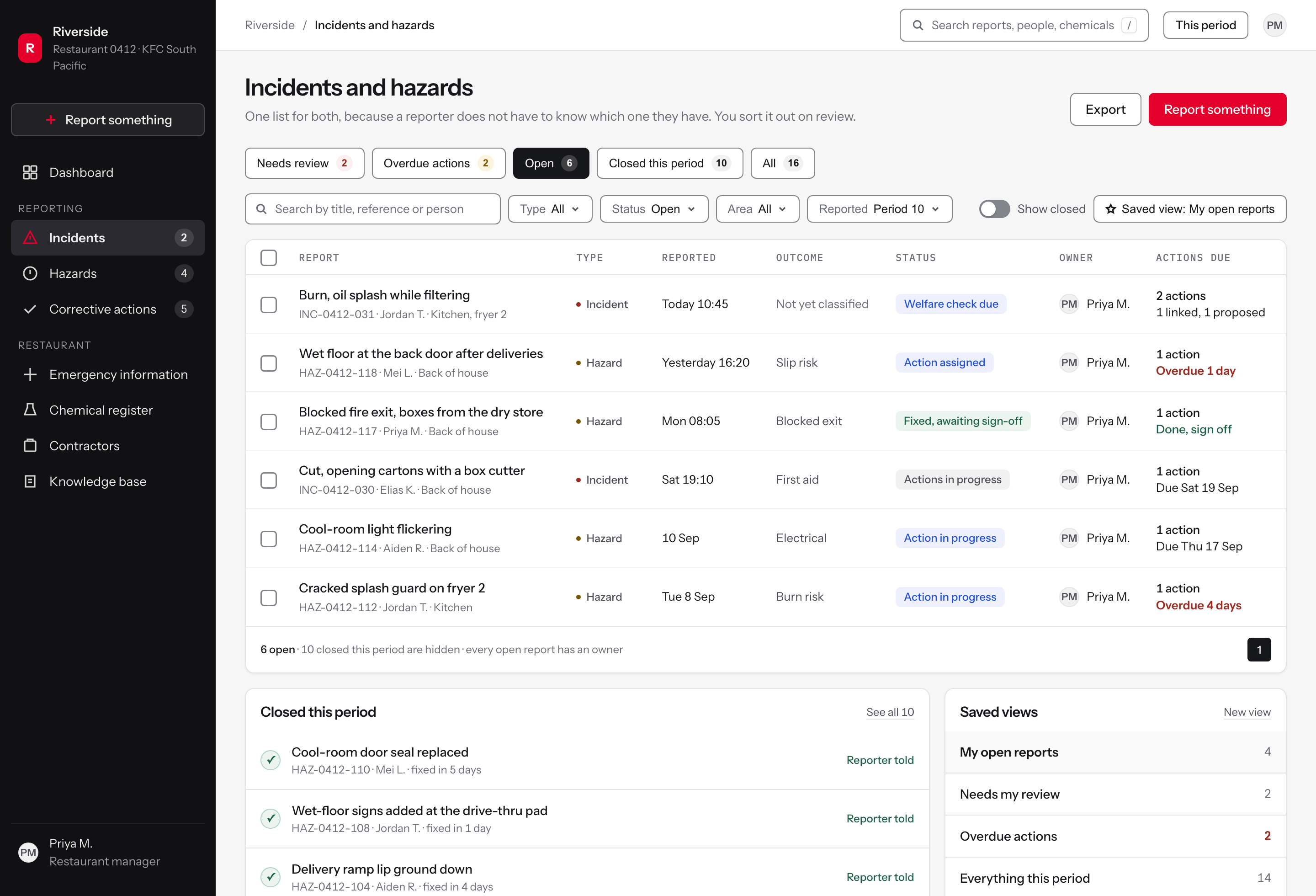
Figure 4The register with the quick filters that match the manager's questions, and the type as a column rather than a menu.
One list, not two
FindingThe form asked for the incident type first, with options such as first aid or lost time that nobody can predict while their hand is under the cold tap, and hazard categories that contained events rather than conditions.
DecisionIncidents and hazards share one register. Type is a badge the manager can change on review, so nobody has to pick the right list before they can report.
RejectedSeparate Incidents and Hazards registers, which pushes the classification back onto whoever is reporting.
The queue opens on what needs a person
FindingMisclassified reports were sent back from above, and people learned that reporting was a way to get something wrong. The manager decided what was worth logging.
DecisionThe first quick filter is Needs review, and each filter carries its own count, so the manager sees the work waiting on them before anything else.
RejectedA severity-ranked default sort, which puts the classification decision back at the top of the page.
The row names the person
FindingPeople reported to a person, not a platform. Team members described telling the manager first, almost without exception.
DecisionEvery row carries the reference, the reporter and the area under the title, so the list reads as things that happened to people on a shift.
RejectedA reference-first row, which reads as a ticket queue and loses who it came from.
Unclassified is a normal state
FindingIncident type came first on the old form, and the notifiable-to-the-regulator question sent people to a compliance matrix that even area safety leads asked for help with.
DecisionThe outcome column says Not yet classified until the manager sets it after the welfare check. An unclassified report is a stage, not an error.
RejectedDefaulting new reports to the lowest severity, which makes them disappear from the work that needs attention.
Status is the next action
FindingReporters rarely heard what happened next, and minor reports were closed without a word.
DecisionStatus names what happens next and who owes it: welfare check due, action assigned, fixed awaiting sign-off. The list is a set of obligations, not a set of states.
RejectedOpen and Closed only, which hides the step the report is actually waiting on.
The states that matter
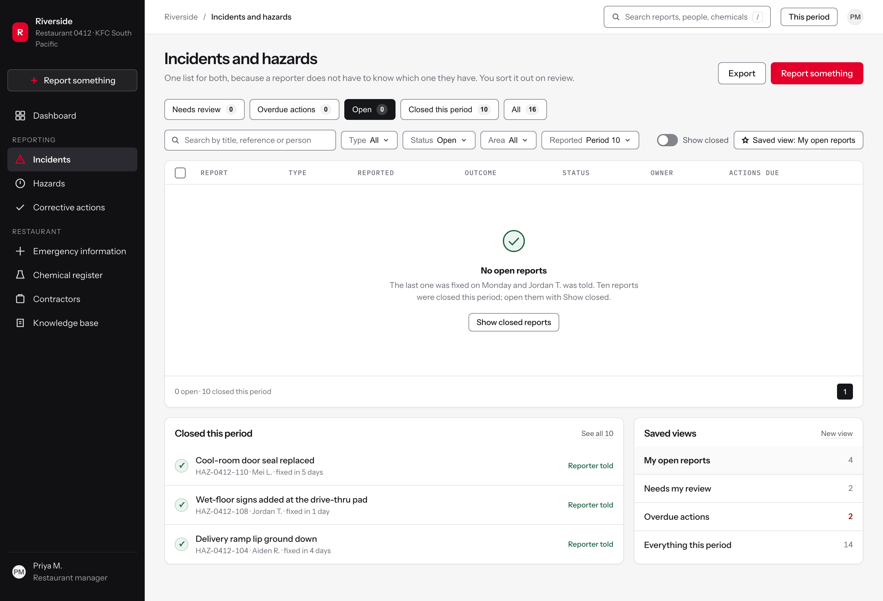
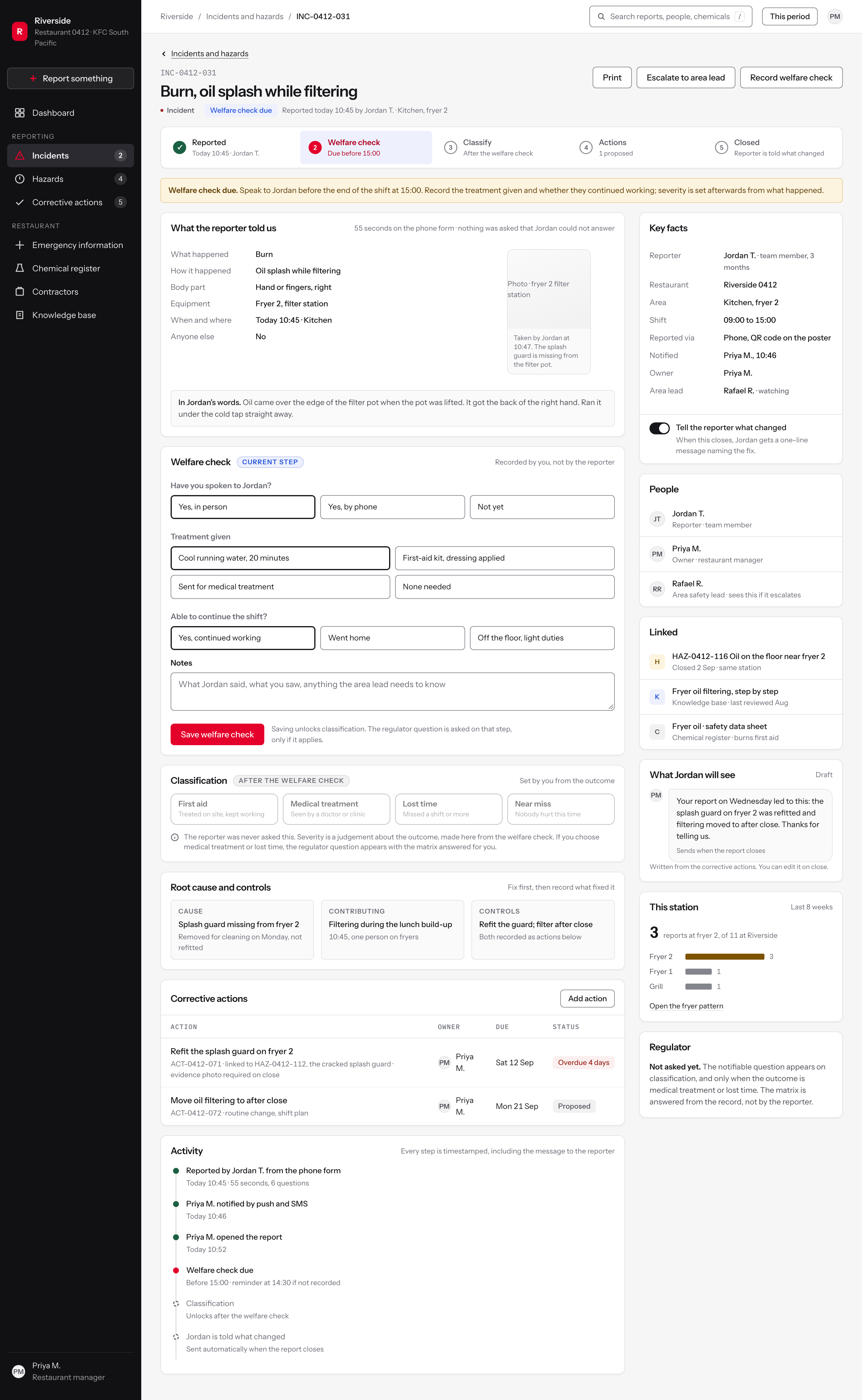
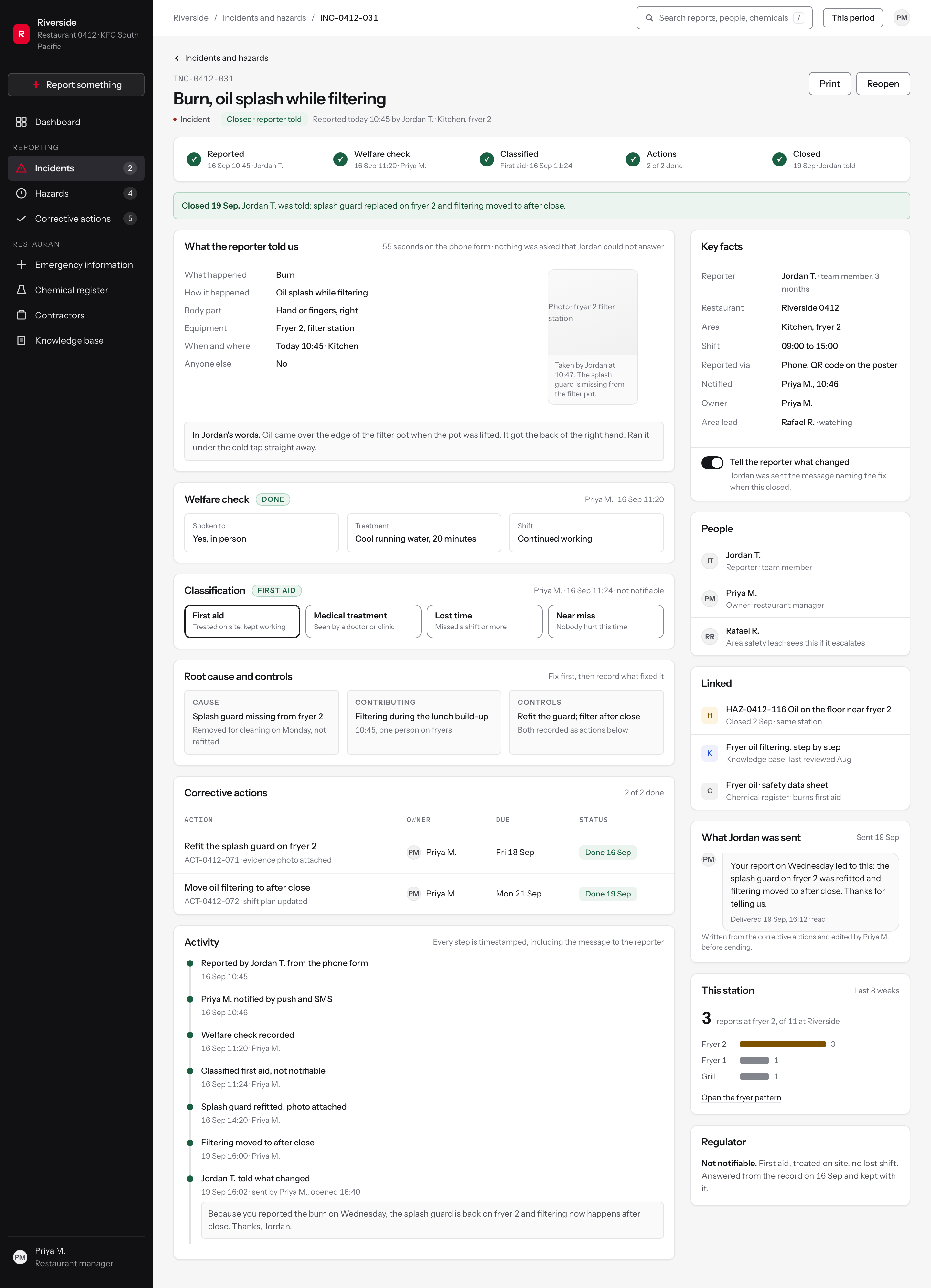
The incident record: welfare first, classification after
The old form asked for the outcome before the event. Severity and the regulatory question sat at the top, answered by a person who could not yet know, and corrected later by someone above them. People learned that reporting was a way to get something wrong.
The record puts the sequence back in the order the shift actually runs. What the reporter told us, then the welfare check, then the classification drawn from what happened, then the cause and the control, then the actions, then the person who reported it being told what changed.
The status pipeline across the top is the argument in one line: the record is not finished when it is logged, it is finished when someone has been told.
Figure 5The incident record. The welfare check is the current step, and the classification below it is a manager's judgement recorded after the fact, not a reporter's guess recorded before it.
Named stages, in the order the work happens
FindingThe old form asked for the outcome before the event, and classification errors were flagged back from above after the fact.
DecisionThe record runs on five named stages and shows which one is current. Classification stays locked until the welfare check is recorded, so severity is set from what happened rather than from a guess.
RejectedA free status dropdown the manager can set to anything at any time, which is how misclassification happened.
Speak to the person first
FindingTeam members told their manager first and trusted them. The barrier to reporting was the form, the phone and the threshold, not fear of the manager.
DecisionThe first thing the record asks of the manager is a welfare check, with a deadline tied to the end of the reporter's shift rather than to a business day.
RejectedOpening the record on the classification form, which treats the report as paperwork before it is treated as a person who got hurt.
What happened, and how
FindingIncident type came first on the old form, with options such as first aid or lost time that nobody can predict while their hand is under the cold tap.
DecisionThe record opens with the mechanism in the reporter's own terms: what happened, how, body part, equipment, when and where. Every field is something the person could answer at the time.
RejectedKeeping the industrial taxonomy and adding help text and examples to each field. The categories were the problem, not the labelling.
What the report cost the reporter
FindingManagers said a report takes one to three minutes. The cost people actually felt was stepping off the floor during a rush and needing permission to do it.
DecisionThe record states how long the report took and that nothing was asked which the reporter could not answer, so the cost of reporting is measured on every report rather than argued about.
RejectedDuration metrics as a separate analytics panel, which nobody in a restaurant opens.
Severity is a judgement about the outcome
FindingA compliance matrix was where the notifiable-to-the-regulator question sent people, and even area safety leads admitted asking the restaurant's safety champion which option to choose.
DecisionClassification sits after the welfare check, is set by the manager from the outcome, and states plainly that the reporter was never asked. The regulator question appears only when the outcome makes it relevant, with the matrix answered from the record.
RejectedAsking the regulator question on the reporter's form, where it produced errors that came back as criticism.
The state that matters
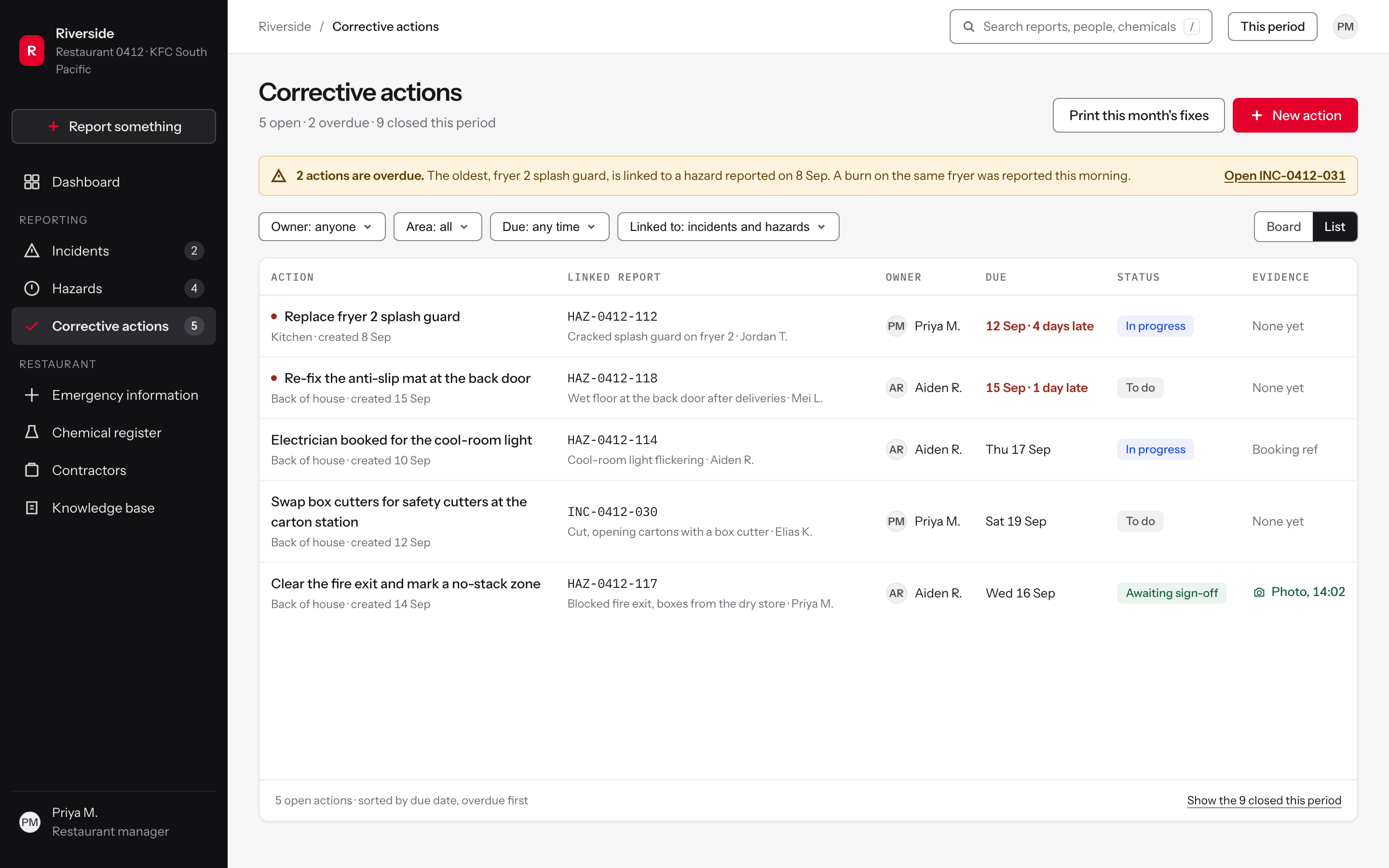
Corrective actions: the half that was invisible
Reporters rarely heard what happened next. Minor reports were closed without a word, which built the belief that reporting helps you with a claim but does nothing for anyone else. The exception proved it: the restaurant where a faulty piece of equipment was fixed the same day had a story people kept telling.
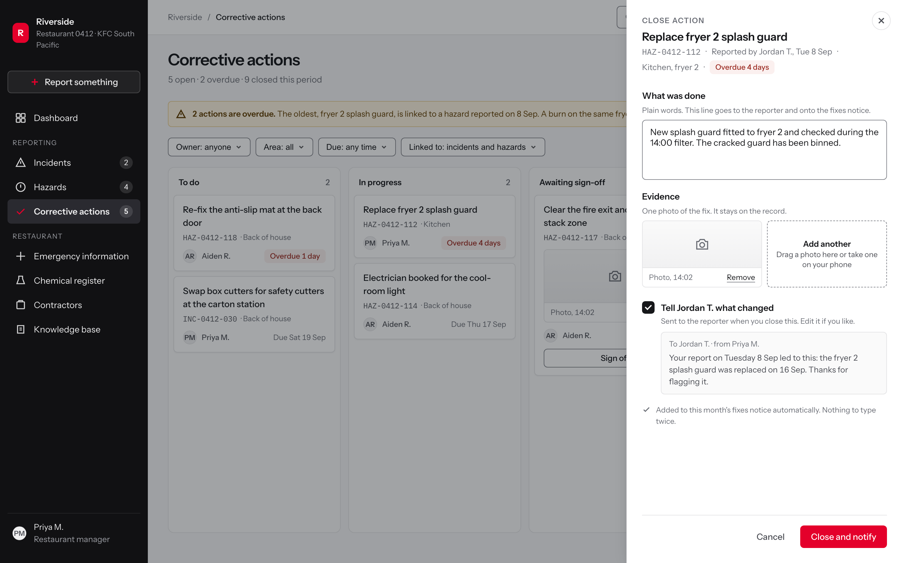
Actions are the part of the service where a report turns into a change, and in the old workflow they were the part nobody outside the office could see. Here they are a board with owners and due dates, and closing one asks for evidence and offers to tell the person who reported it, with the message written for them.
The proposal rejected recognition programmes that reward report counts. The safety team's view was blunt: put an incentive on hazard reports and you get reports, not fewer hazards. So the artefact this module produces is a notice of outcomes, not a leaderboard.
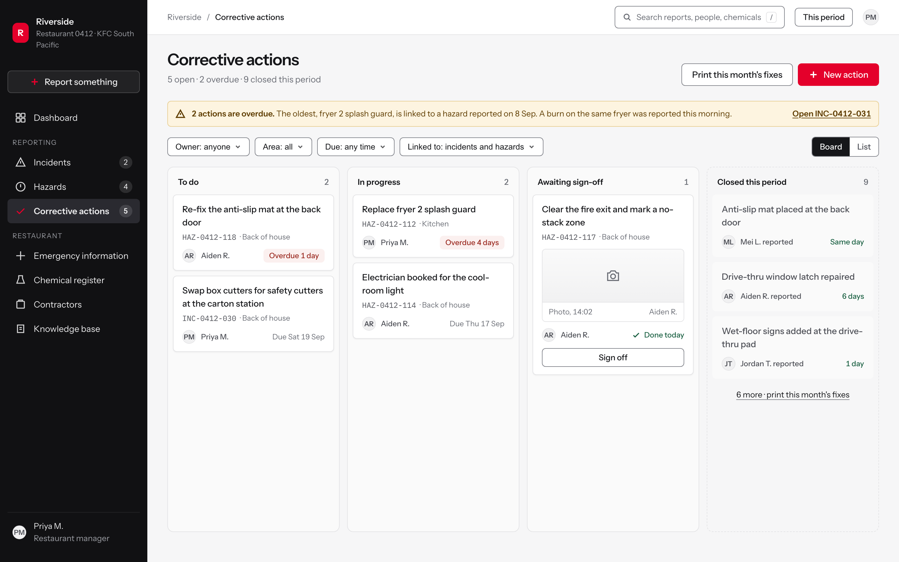
Figure 6The corrective actions board. Overdue is a state of the card, not a report someone runs, and the closed column is the one the monthly notice is printed from.
The overdue notice names the report it came from
FindingThe safety team pointed out that a pile of hazard reports about the same thing, followed by an injury claim, documents poor housekeeping: reporting only helps if the fixes are recorded too.
DecisionThe overdue notice names the hazard the action came from and the new incident on the same fryer, so an ageing action reads as risk rather than as admin.
RejectedA plain count of overdue items with no link to the reports behind them.
One step from the late action to the incident it now concerns
FindingWhere team members could not report directly, managers noted the basics on paper and entered everything at the end of the shift: double handling, and details got lost.
DecisionThe notice links straight to the new incident, so the manager moves between the two records without re-keying a reference or searching the register.
RejectedMaking the manager find the incident by typing its reference into search.
Lateness is on the card, in days
FindingWhen incidents pile up the pressure is to close them quickly, which leads to shortcuts and reports closed without the proper steps.
DecisionOverdue actions carry a red edge and the number of days late beside the owner, so lateness is visible during a shift instead of surfacing in a monthly report.
RejectedA separate overdue report, or an email digest that arrives after the fact.
Every action carries the report it came from
FindingOnce a team member has told the manager, they have no visibility of what happens next or whether anything was logged.
DecisionEach card shows the reference of the report that produced it, so the system already knows who to tell when the action closes.
RejectedA free-text task list kept apart from the reports, which is what left reporters with nothing to follow.
A photo taken at the fix, not a memory test at sign-off
FindingA manager described trying to resolve the issue on the spot and logging it afterwards, still recording the update.
DecisionSign-off asks for one photo taken at the time of the fix, so the evidence is captured on the floor and the manager's step is a check rather than a reconstruction.
RejectedA written close-out form with no evidence, which makes a quick close and a real fix look identical.
The states that matter
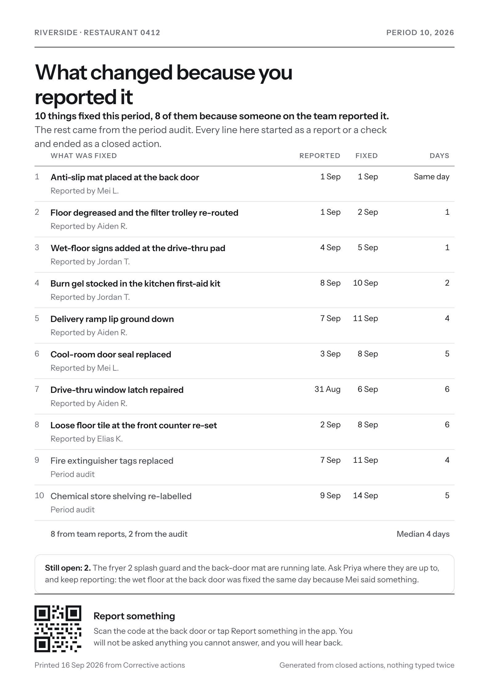
The monthly notice, decision by decision
Addressed to the reporter, not to the auditor
Finding18 of the 41 respondents who answered the question, 44 per cent, said they never or rarely learn the outcome of a report, and restaurant visits confirmed that most team members never hear what corrective action followed.
DecisionThe notice speaks to the person who reported, leads with what changed, and is posted where the team already stands.
RejectedA safety scorecard or a percentage-closed figure, which answers the head office question rather than the reporter's.
Every line names who reported it
FindingA team member said minor incidents just get closed off, and only the more important ones are communicated back.
DecisionEach fix names the person who reported it, first name and initial, so the small reports appear beside the large ones and the credit is specific.
RejectedAn anonymous list of completed work, which is indistinguishable from maintenance the team never asked for.
Days to fix is the number on the page
FindingSeeing logged hazards changed quickly was, one team member said, why he kept reporting.
DecisionReported, fixed and days-to-fix are the only figures, with the median beneath them, so speed of response is what the notice reports.
RejectedA count of reports received, which measures the team rather than the response to them.
It says what is still late, and who to ask
FindingOnce a team member has told the manager, they have no visibility of what happens next or whether anything was logged.
DecisionThe notice names the two actions still open and who to ask about them, so it works as a status the team can check rather than a selective good-news poster.
RejectedPublishing only completed work, which would make the notice unreliable the first time somebody noticed an omission.
Generated from the closed actions, typed once
FindingWhere reporting ran through the manager, the basics went onto paper and were entered at the end of the shift: double handling, and details got lost.
DecisionThe notice is generated from the actions closed this period, using the words the manager already wrote at sign-off, so nothing is written twice.
RejectedA manually written monthly poster, which is the first thing dropped in a busy period.
Emergency information: the screen nobody reads until they must
Emergency information was not the study's focus. The restaurant visits did look at the posters, the first-aid cabinet and the office setup, and the finding that carries over is the one about language: the people who need this are new, busy and do not know the terminology.
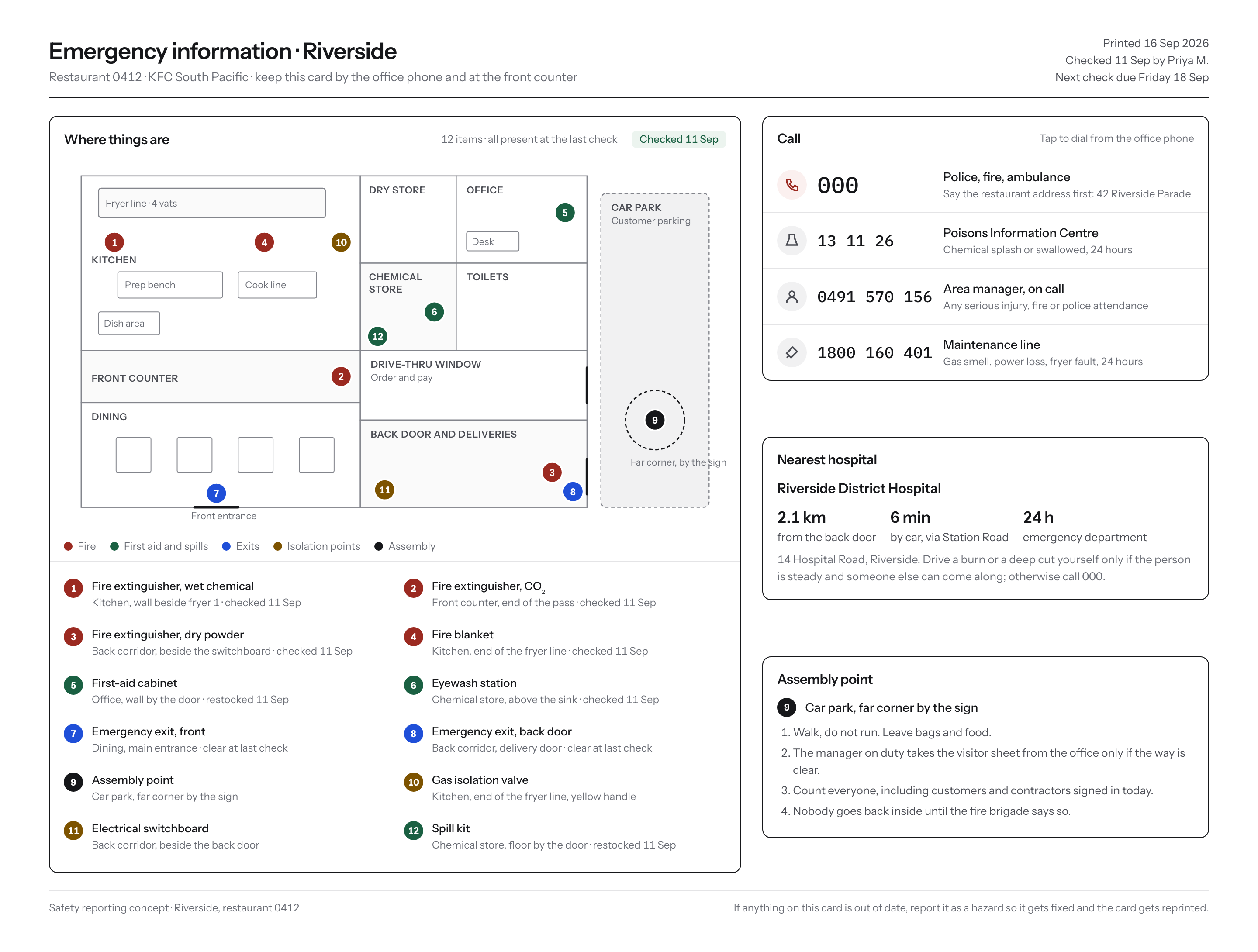
So the module is a picture of the restaurant rather than a list of records: where the extinguisher, the blanket, the eyewash and the spill kit actually are, with a legend in plain words and a date beside each check.
The right-hand column is the part used under pressure. Numbers big enough to read at arm's length, in the order you would need them, with the first-aider roster showing its own gap rather than hiding it.
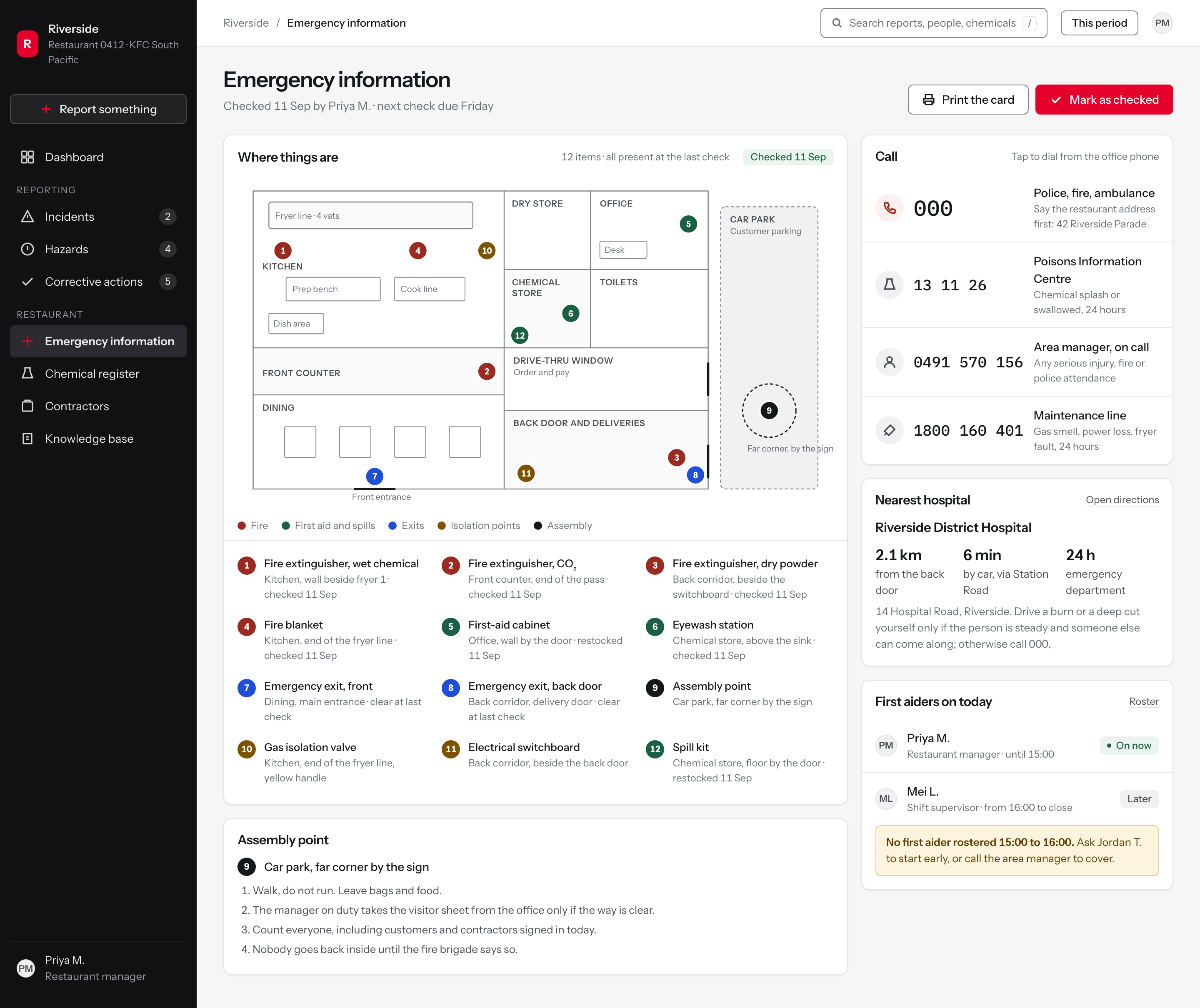
Figure 7Emergency information for one restaurant. The floor sketch is the record; the list beneath it is how the record gets checked.
The check is the primary action, and its date sits on the page
Design decisionDecisionThe restaurant visits in this study looked at the physical setup as well as the software: the posters, the first-aid cabinet, the office. Those things drift, and a page about them is only as good as its last look. So the page states who checked it and when, names the next check as a day rather than a date range, and makes Mark as checked the primary button. The record of the check lives on the thing being checked.
RejectedA separate compliance checklist in another module. It makes the check somebody else's job and leaves this page quietly out of date.
A plan drawn in one colour, with numbers doing the work
Design decisionDecisionThe plan is flat outlines with rooms named in small caps and fittings as plain rectangles. Every item is a numbered circle and the number is the only link to the legend, so the drawing never has to carry a text label. That matters most in the kitchen, which holds the most items and has the least room.
RejectedLabels printed on the plan itself. At this size they collide around the fryer line, which is the one place someone in an emergency cannot afford to lose.
Every item says where it is in words, and when it was last checked
Design decisionDecisionThe legend repeats each location as a sentence, such as Kitchen, wall beside fryer 1, and carries the date it was last checked or restocked. The research found the platform was a configured product used through paper and people as much as through screens, so this card has to survive being printed and taped inside a cupboard door with no app near it.
RejectedA location code keyed to the plan. Shorter, and nobody can act on it without the plan in front of them.
The state that matters
Chemical register: an obligation that expires
Chemicals were outside the study's scope. The principle applied here is the one the research established everywhere else: the system should answer the question the person on shift actually has, in language they already use.
A safety data sheet is a compliance document with an expiry date, so the register leads with what is expiring and what is missing rather than with an alphabetical list of products.
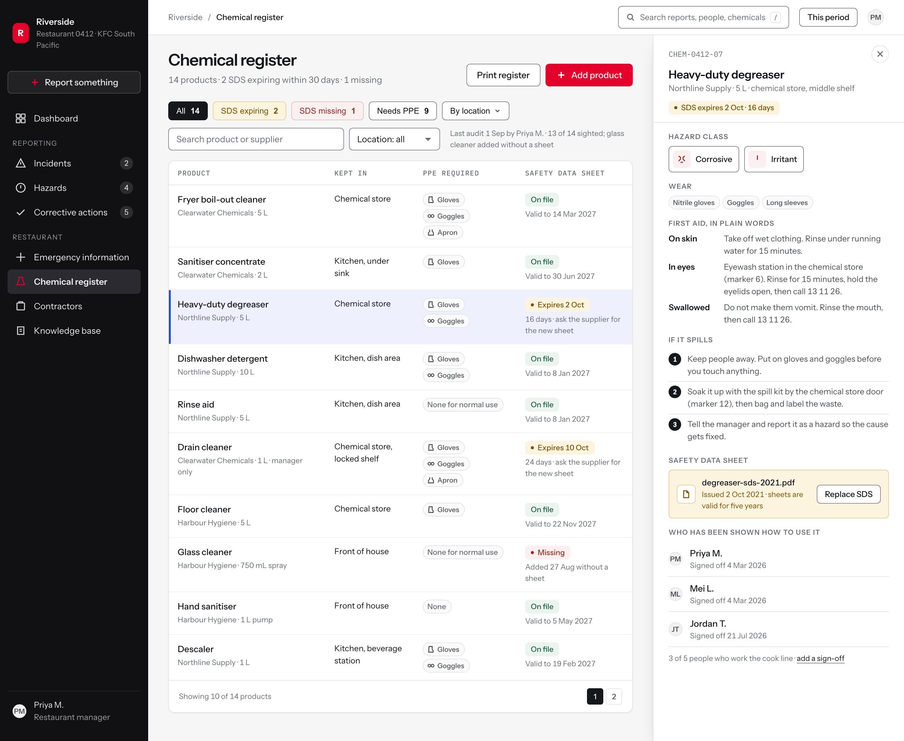
The panel is written for the moment it is needed: what this is, what to wear, what to do if it goes on skin or in eyes, and the three steps for a spill. The regulatory document is attached underneath, not in front.
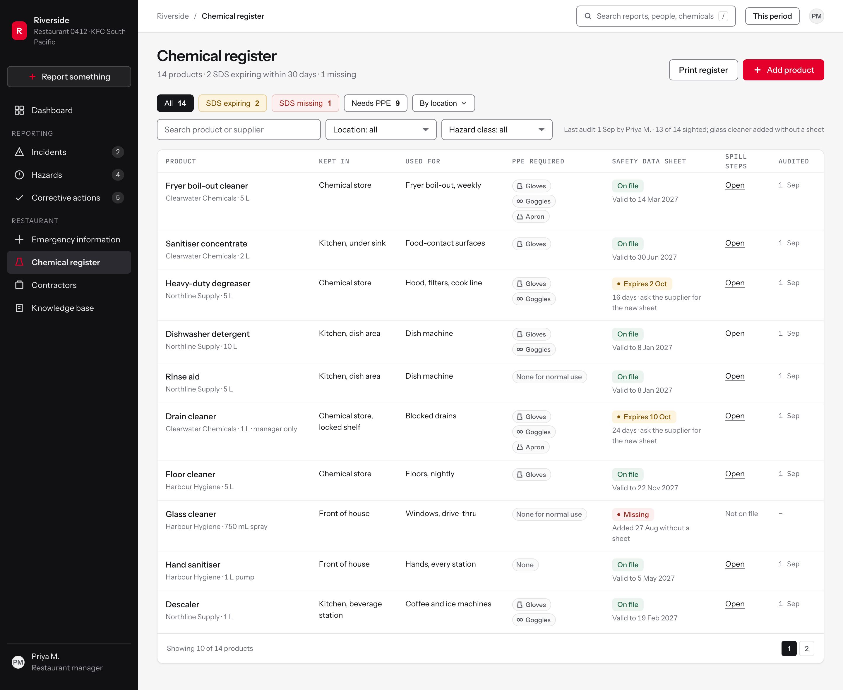
Figure 8The chemical register. Status first, alphabet second, and PPE as a column so a new starter can read the requirement without opening anything.
The page opens with its exceptions, not its total
Design decisionDecisionThe sub-line reads 14 products, 2 safety data sheets expiring within 30 days, 1 missing. A register is only interesting where it is wrong, so the two numbers that need work are stated before anything is clicked.
RejectedA compliance percentage. It is one number that hides which product is the problem and reads as a score to be defended.
Filters that state the number they will filter to
Design decisionDecisionEach chip carries its count, tinted with the badge's own token, so a register with nothing wrong says so before anyone clicks.
RejectedA plain dropdown, which gives the page nothing to say at rest.
The audit is a fact on the page, with what it covered
Design decisionDecisionLast audit 1 Sep by Priya M., 13 of 14 sighted, glass cleaner added without a sheet. Naming the person and the coverage turns an audit from a status into something the manager can check, and it makes a partial audit visible rather than rounding it up to done.
RejectedA green Compliant badge. It says less and it cannot be wrong in a useful way.
The state that matters
Contractor management: the people the system forgets
Contractors were outside the study's scope. The finding that carries over is that managers work through the system on behalf of everyone else, and that open hazards were held in a record nobody on the floor could see.
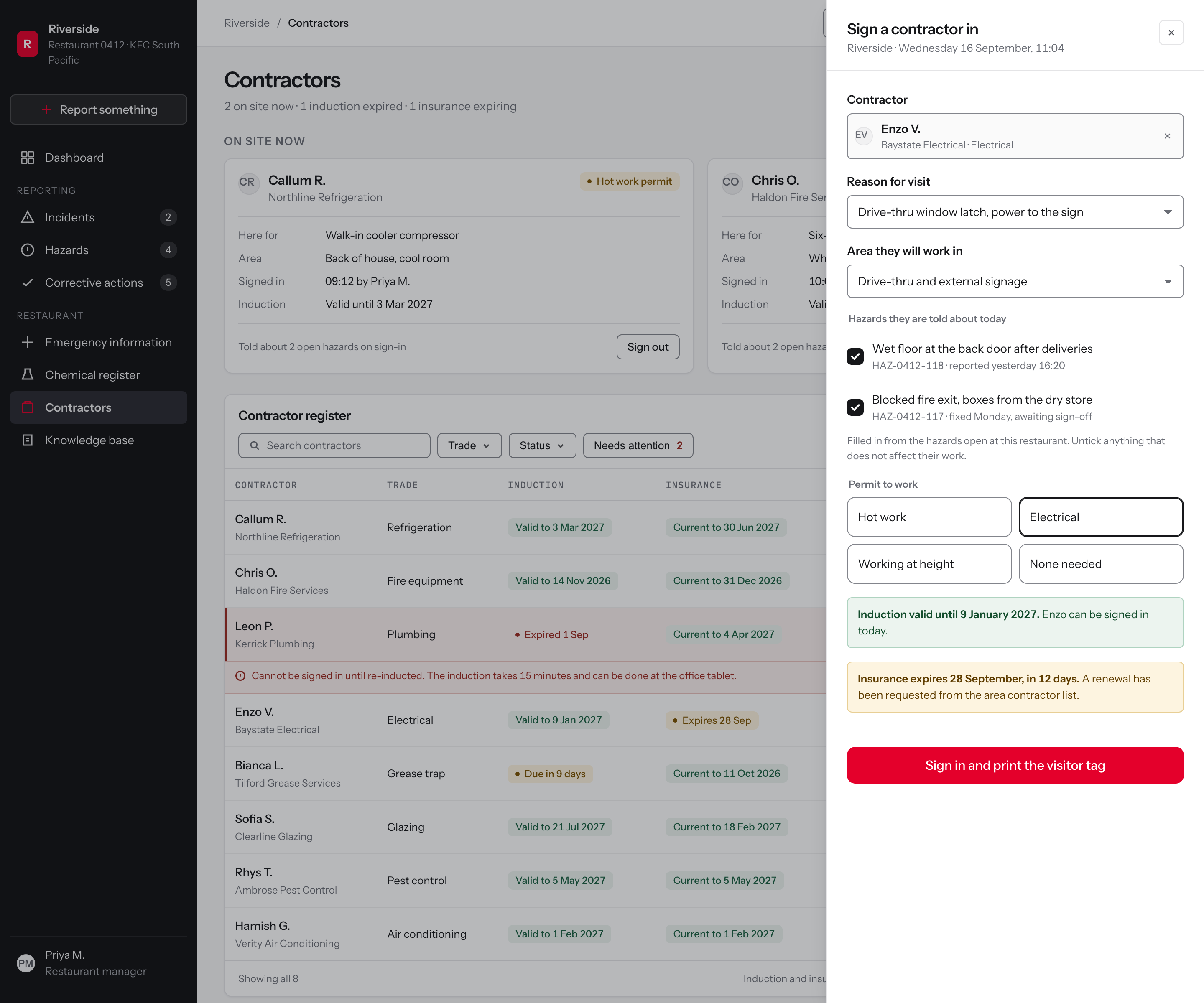
Signing a contractor in is where an open hazard becomes useful to someone who has never been in the building: the sign-in reads the restaurant's open hazards and tells them, on the record, before they start.
Induction and insurance are dates that expire, so they are badges with a date on the row rather than a document someone has to open to find out.
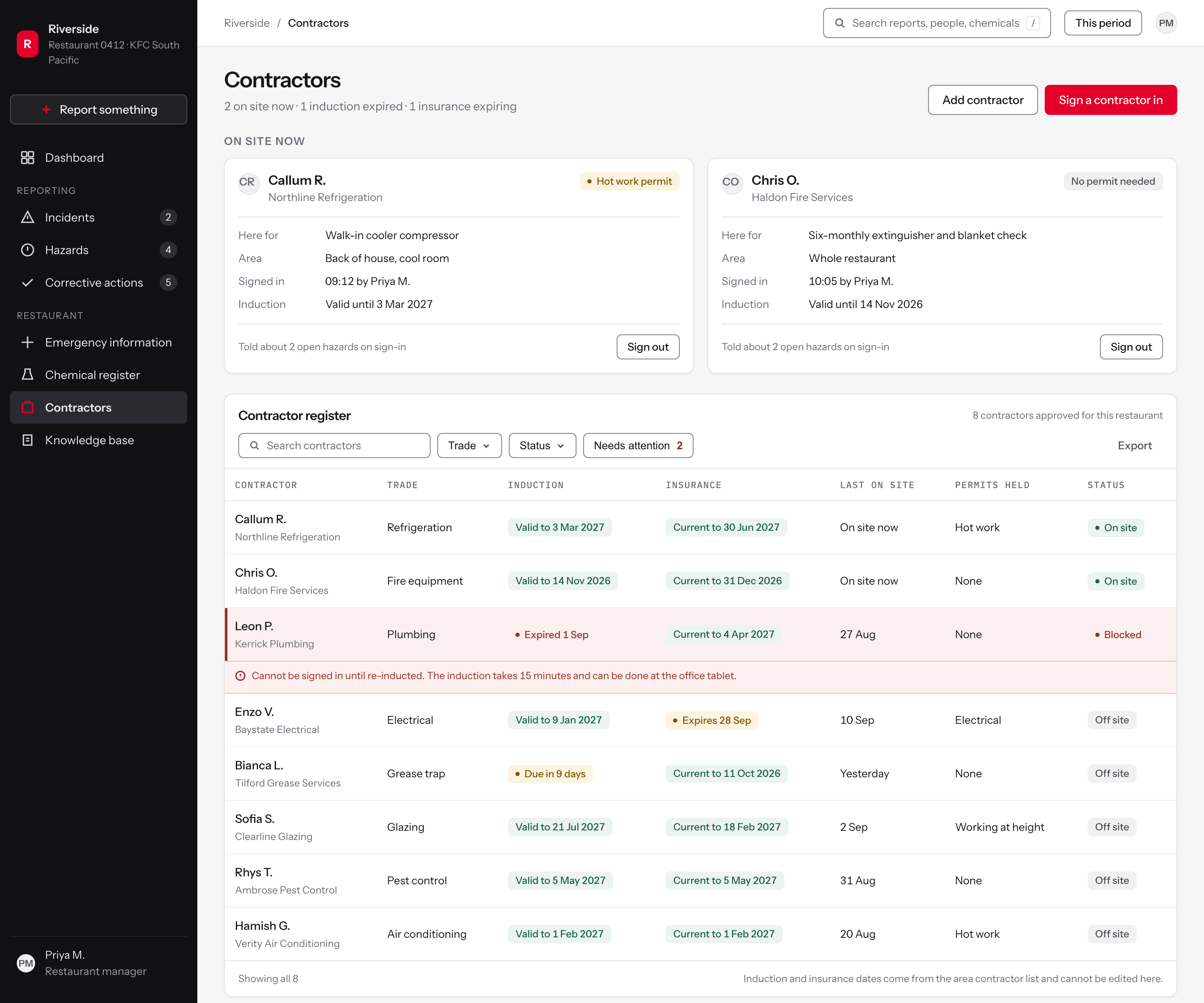
Figure 9Contractors. Who is on site now sits above the register, because that is the question a manager is asked, not who is on the list.
Who is in the building, before the register
Design decisionFindingThe research found that people report to a person rather than to a platform, and that the manager is the one who works the system on the team's behalf.
DecisionThe module opens on the two contractors on site right now, with what they are here for and who signed them in. The register sits underneath it.
RejectedOpening on the full contractor register, which is an administrative list and answers nothing a manager needs during a shift.
The hazard briefing is recorded, not assumed
Design decisionDecisionSign-in fills the hazard list from the restaurant's open hazards and records which ones the contractor was told about, so the card can state it afterwards.
RejectedA single 'site induction given' tick, which records that something was said but never what.
The count is the filter
Design decisionDecisionThe two records that will stop work are counted in the page sub-line and offered as one filter chip, so the manager reaches them without reading the table.
RejectedA red dot on the sidebar, which says something is wrong without saying what or where.
The state that matters
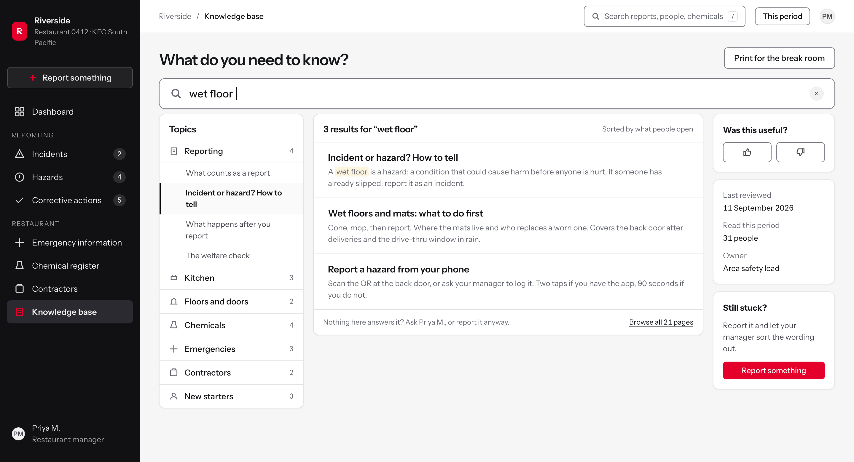
Knowledge base: the threshold question, answered
The barrier was not fear. Team members trusted their managers and nobody described feeling embarrassed to report, even when they had been doing the wrong thing. The barrier was the form, the phone and the threshold: not knowing whether a thing counted. A plain-language guide to what counts was one of the concept mockups delivered in December 2025.
So the knowledge base opens on the question people actually type, and its first article is the one that unblocks reporting: incident or hazard, with examples from a restaurant rather than definitions from a standard.
The answer to not being sure is written into the article and matches the promise the reporting flow makes: report it as whatever it looks like to you, and the manager sorts out the classification from what happened.
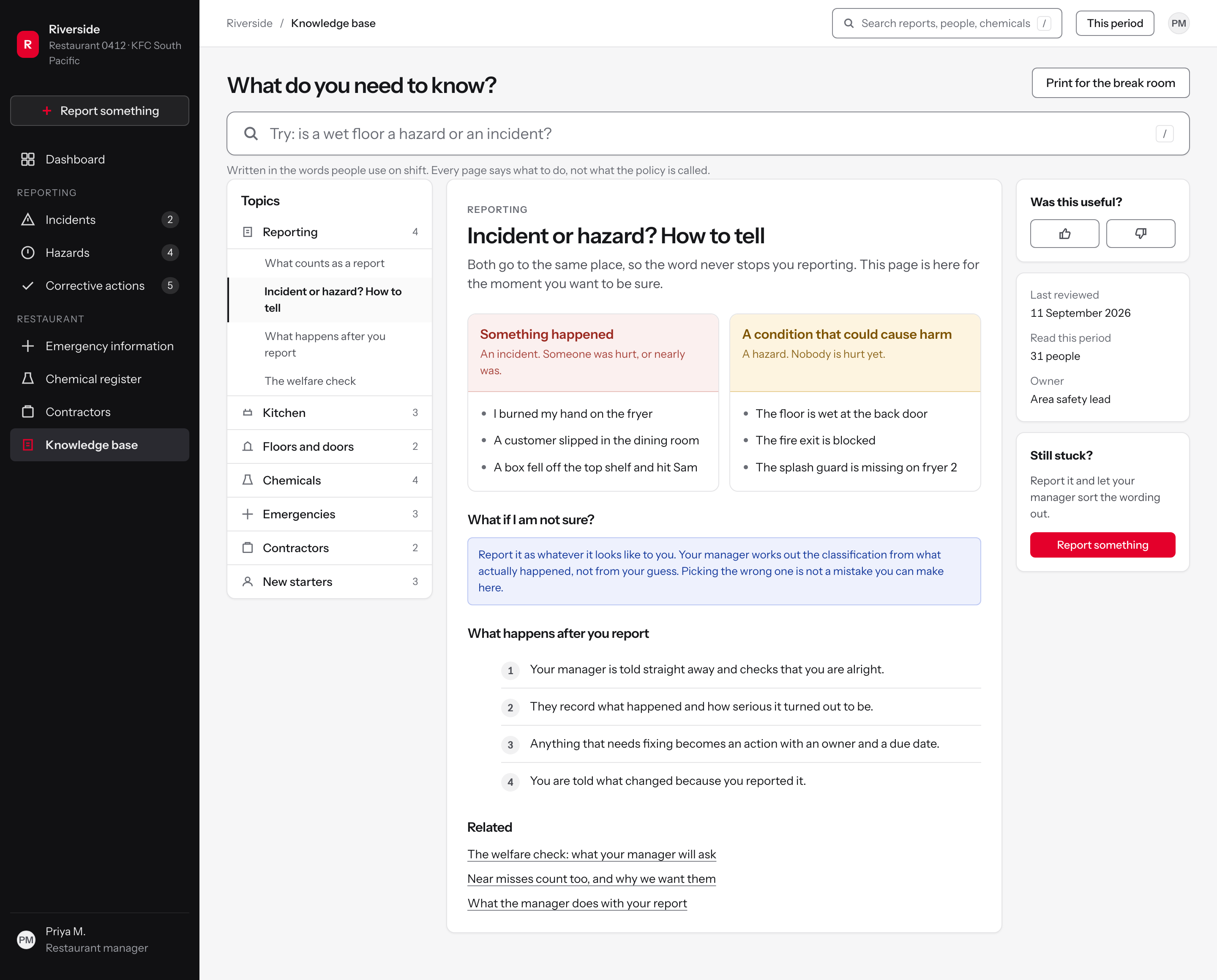
Figure 10The knowledge base. Search first, then the article that resolves the threshold question, with the examples in the words people used in interviews.
Search first, in the words people use
FindingTeam members said they had never been told the threshold, so each person set their own. Survey responses showed awareness that incidents should be reported but no common understanding of what counts.
DecisionThe page opens on one search field whose placeholder is the question people actually ask: is a wet floor a hazard or an incident?
RejectedA grid of category tiles, which asks the person to already know the word they came here to look up.
Topics named after the shift, not the policy
Finding22 of the 40 respondents who answered the question said they had received no formal training on the reporting platform they were expected to use.
DecisionSeven topics in shift language, with the article count beside each and the open topic held open so the person can see where they are.
RejectedPolicy-document naming and a nested compliance hierarchy, which is how the material was already organised and was not being read.
Incident means something already happened
FindingThe hazard form offered options that were clearly incidents, such as an attempted assault, which is an event rather than a condition. Reporters could not tell which form to use.
DecisionOne test, in one sentence: did something happen. Three examples in the reporter's own words, drawn from the kitchen and the dining room.
RejectedReproducing the platform's own taxonomy, which is the thing that caused the confusion.
The state that matters
One set of tokens, one set of components, three products
Every screen here is built on one design system: a token file for colour, type, spacing and radius, and a component library the workforce and hiring products share. Nothing is a UI-kit template and nothing is a flat picture of a component. Each screen is a working layout, which is why its states, spacing and type can be checked, and why the same badge, table row and drawer appear on all three products.
The type scale has eight steps from a 14px base, the smallest 11px for badges and labels, and a lint fails any screen that sets a size outside them. Spacing is a 4px grid. There are three radii and two elevations. Colour is one neutral ramp plus four status pairs, each pair a foreground and a ground; a contrast script checks every text pair at 4.5 to 1 and every border at 3 to 1 before a screen is captured, and the muted ink and the strong line were both darkened after it failed them.
Numbers are set in tabular figures so a column of counts aligns. Status is never carried by colour alone: every badge has a dot and a word. The sidebar is the one dark surface, which keeps the working area white and lets a status colour mean something. Components were lifted into the shared file once a second screen needed them, which is how the drawer, the numbered step list, the comparison pair and the oversized search field arrived.
The system itself is on one page. The token file as compiled, the component manifest an agent must search, the gates that fail the build and the one that failed for real, and this product's table row beside the other two: one design system, three products.